Corporate identity
Sam Sake
Related Projects:
Sam Sake is a London-based importer of fine Japanese sake. Sam Sake distributes sake both to restaurants and directly to the consumer.
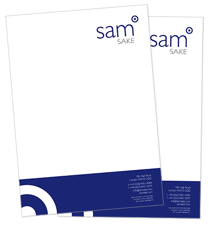
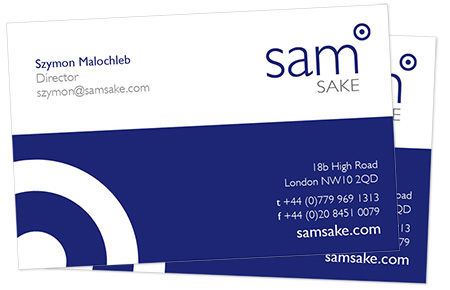
As Sam Sake looked to grow its brand awareness in London, they turned to us for help. They wanted a corporate identity that drew on both its status as a British company and its connection with Japan and the history of sake. Working closely with Sam Sake, we researched the topic of sake and explored approaches to establish the visual connection they sought. We created a logotype and company stationery that combined the RAF circle icon with traditional sake cup designs: concentric circles.
Following the crafting of the logotype, we applied the new design to business cards and headed paper, and created logo usage guidelines for the sake importer.
The corporate identity in place, we turned our attention to the design and production of a colourful and powerful website that enabled Sam Sake to promote its brands, customers and events in a dynamic and exciting manner.